Kathrine Frich
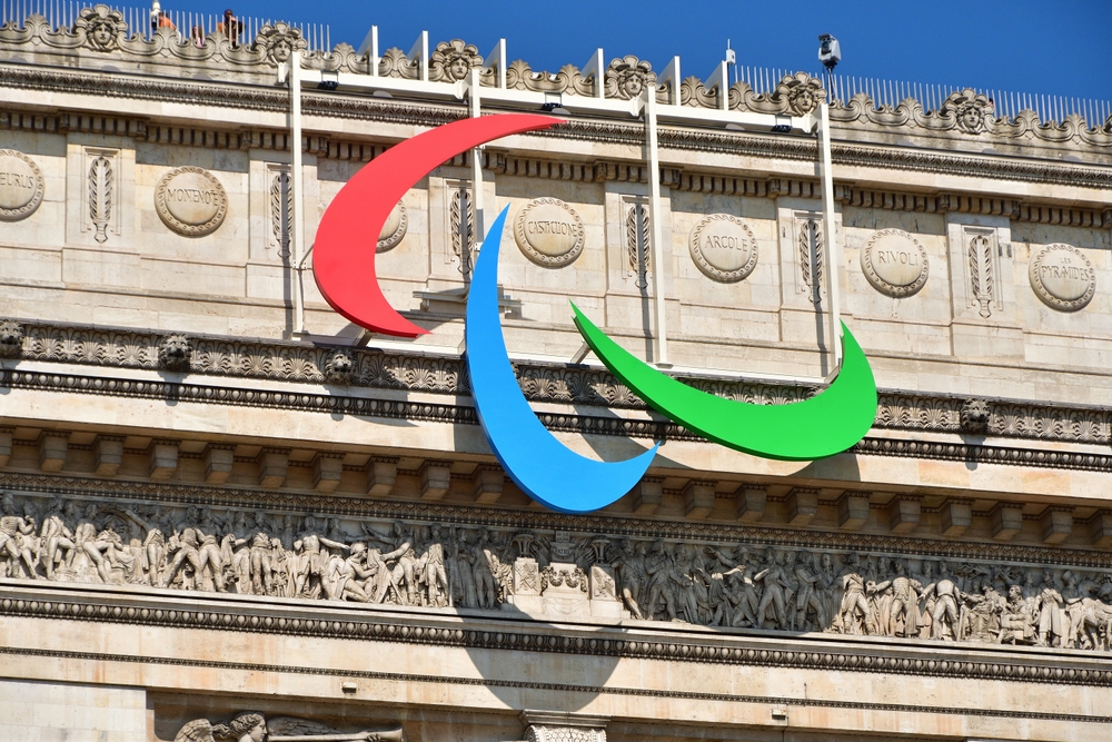
The Agitos will be prominently displayed on the Arc de Triomphe throughout the Games.


As the Paris 2024 Paralympic Games approach, the city is preparing to showcase a symbol that embodies the spirit of the event: the Agitos.
More than Half the Tickets Sold
These three colorful swooshes—red, blue, and green—are the official symbol of the Paralympic Games and represent the global movement of Paralympic athletes.
The Paralympic Games, which begin on August 28, follow the conclusion of the Olympic Games. Excitement is building, with over 1.2 million tickets already sold — a milestone that has exceeded expectations.
“We’ve sold more than half the tickets,” said Tony Estanguet, President of the Paris 2024 Organizing Committee, highlighting the growing interest in the event.


Mirrors the Olympic Rings
The Agitos have a rich history. The first Paralympic logo, created in 1960, featured three wheels, symbolizing the wheelchair users who were the only participants at the time. Over the years, the logo evolved, featuring various designs until the modern Agitos were introduced in 2004.
The current design consists of three asymmetrical crescents, each representing movement, determination, and the unwavering spirit of Paralympic athletes. The name “Agitos” comes from the Latin word meaning “I move,” perfectly capturing the essence of the Paralympic movement.
In a gesture that mirrors the Olympic rings on the Eiffel Tower, the Agitos will be prominently displayed on the Arc de Triomphe throughout the Games.
This iconic location was chosen for its symbolic importance, as the Paralympics’ opening ceremony will take place nearby on the Champs-Elysées and Place de la Concorde.